Thursday, December 3, 2015

Coloring Book Closing Thoughts

As the semester comes to a close, so does the first HUGE component of my internship. The Erie Dinosaur Park Coloring and Activity Book. This project has absorbed a big part of my semester and life in general so it is very near and dear to my heart! As I type, a PRINTED COPY of the book is laying right next to my keyboard. That's right, a hard copy! In my hands! That I can hold and color in! Rather exciting business if you ask me. Here is a run through of the process this book went through to become an actual feasible, holdable book.

We began with the initial concept phase. My first step was to develop characters to tell a story with...
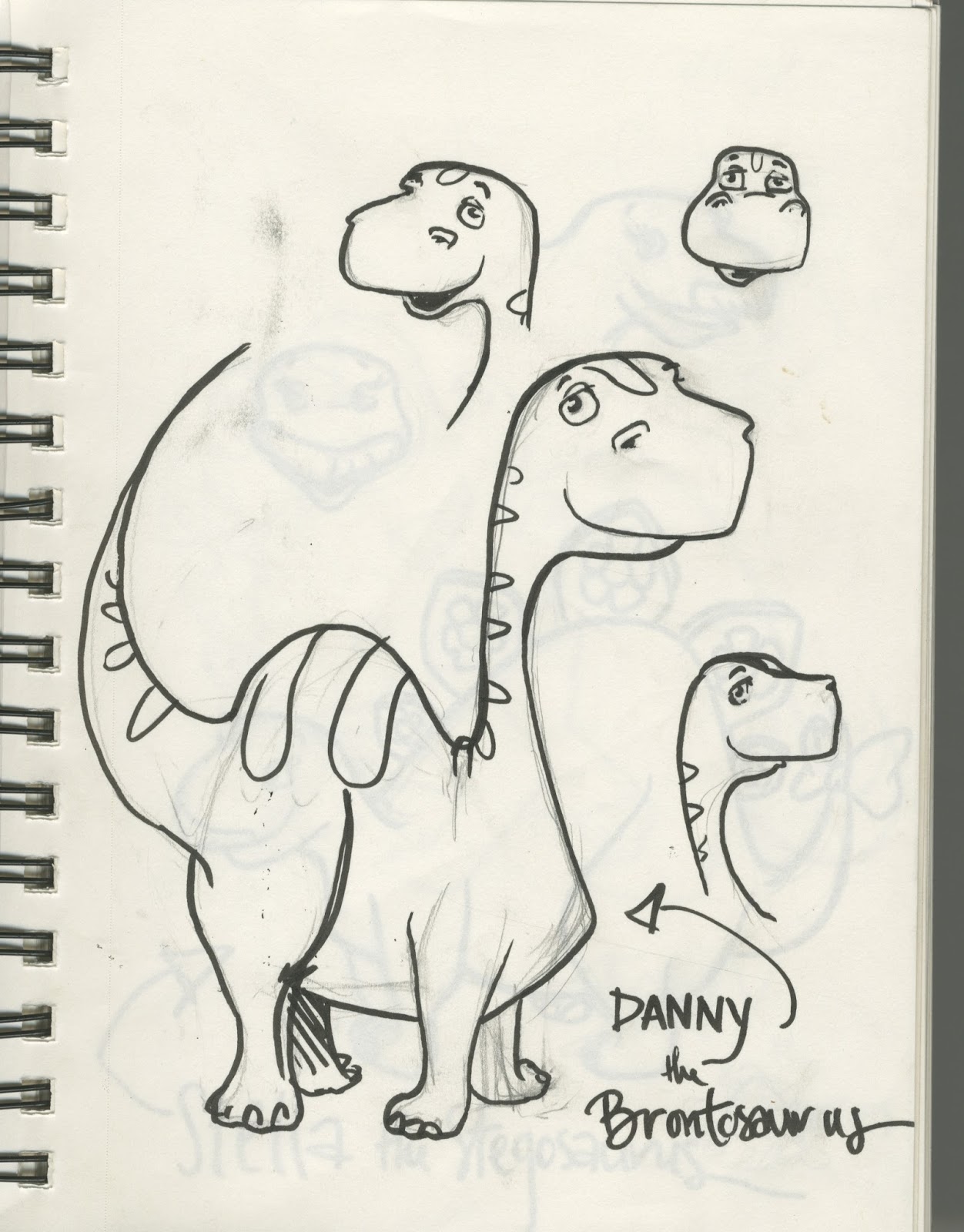
The first character sketch of Diesel (Originally named Danny)

Once I had figured out my little dinos, I then had the task of developing a story for them! What would they do? Where would they go?? I decided to have them go on an adventure (who doesn't love an adventure!) and I also wanted them to explore as many different atmospheres as possible- island, desert, snowy mountains, forest.... I felt that this would give kids variety to keep them interested. And it's fun to color! All with the end goal of reaching their new home in Erie.
After the journey, they find Kansas!
Along with the story and coloring pages, I also chose to include activity pages! I chose some of my favorites from when I was growing up.
Hand lettered word search
A fun maze
There are four activities total.
Next was selecting an image for the cover, I went over that process in my last post.

After that was the back page, recognizing the donors who helped with the cost of printing. Along with the Dorris family for their donations, and some general information about the park.
Back cover.
2,000books will be printed at 5.5 x 8.5. They are at the printers right now!

This whole internship experience has really showed me that being an artist takes much much more than possessing the ability to be creative and put a pen on the page. It requires interpersonal skills, a commitment to fine details, a certain amount of managerial skills and EMAILS. So many emails. I truly feel that this entire internship experience has shaped me and really given me a taste of my future.. and I like it!

I will be back here in the spring with info about the brochure and rack card component of the internship.

Wednesday, November 18, 2015

Coloring Book Cover

I am sorry for not posting more frequently! My mind has really been stretched thin this semester and some things tend to fall through the cracks (this being one of them!)

In regards to the Cover for the coloring book, I was considering traditional color- a vibrant watercolor. However, in the end I decided to go digital. It is the future after all.

I began with the first page of the coloring book. I decided to go with this image for the cover because I was very pleased with the composition and the line quality achieved. I feel that the dino's were all front and center and this image allowed for some fun color options!

Image from the first page.


 Next, I handlettered the title and my information at the bottom of the page. I felt that this font for the title was fun and complimented the overall aesthetic of the book.
With Text!
 Next comes COLOR. Something rather daunting for me. I tend to work in Black and white, and shades of grey.... However this project required fun, bright, and vibrant colors. 


The final cover design.
Yesterday I took a pdf file of the coloring book to the printing services on campus to print three proofs for us to see how the pages look on the paper and at the size we have chosen to print at (8.5 x 5.5) I CANNOT WAIT to see the finished product.

As of right now, I am in the middle of compiling images and information for the pamphlet to promote the park. I am having a little bit of an issue with the Indesign program that I am using to make the pamphlet. My computer skills are rudimentary at best. However I have been seeking out the help of my Graphic Design savvy friends and they are helping me immensely! Having talented friends is a blessing!  

Tuesday, November 3, 2015

Portfolio


I intend to enter an art fair here at Pittsburg State, where I will be selling my art. For the fair I wanted to post some examples of my art! ENJOY
The final page of a coloring book that I've been working on all semester for the city of Erie, KS. At the end of the semester they intend to print 2,000 copies.


Watercolor and graphite

Watercolor and Ink
Watercolor and Graphite

Graphite selfie
Watercolor and Graphite
Colored Pencil. I've been working on a flower illustrations that I would like to sell prints or originals of at the fair.


Graphite Illustrations from a narrative that I created from a conversation that I had with Mr. Tom Turner at Golden Living Center in Pittsburg.


MORE colored pencil works. A medium that I've really enjoyed exploring lately.

Graphite. This is from a conversation that I had with Mr. Gene Shaffer also at Golden Living Center in Pittsburg.

Colored Pencil
Ink and Watercolor
Ink.


Watercolor portrait for the Student Body President

Watercolor, a gentleman that I met at Golden Living Center last semester.

Along with things like this, I am working on a small auto-bio comic that explores my internal battle between wanting to lead a small, country lifestyle and a city life, living out my dreams as an artist. Titled "Milk and Martini's." This will be entered in the art fair.

Monday, October 26, 2015

Final Batch of Pages!

The last page of the coloring book.

I did it. The day I've been so excited for finally came! I just sent the last of the images for the book to the committee for review. NOW my task is to complete a full color cover. I know that I want to handletter and ink the piece, but I'm trying to decide whether I want to do traditional color, a saturated watercolor perhaps, OR do digital color on photoshop. STAY TUNED FOR ANSWERS

Tuesday, October 13, 2015

Page Process

I thought it would be nice to take you through the process of creating one of the pages for the book.
It starts with a thumbnail sketch like this:

This sketch is for the snowy mountain piece, page 10.


Next comes the blue pencil phase. I'm drawing the pages at twice the print size so that I can get all those good details in. 


Strange picture quality on the second one, but you get it.

Next phase is inking. I prefer to use a brush over the nib because the line quality make is second to none. For the lettering and small details I use a Pitt Technical Pen. 

Inking is the most stressful part for me. It's very FINAL.

Here is the image that was scanned in to photoshop.

After some photoshop magic, the final product looks a little something like this, here is the final draft of page 10:


Sunday, October 11, 2015

Erie Coloring Book Concept

A little bit about the book itself! It consists of 12 coloring pages, 4 activity pages (connect the dots etc.) and a full color cover. The book is going to be printed at the size of 8.5 x 5.5. The most exciting thing about this whole thing is that the committee has decided to print 2,000 copies! I am so incredibly humbled and honored by the confidence that they have in me.

Since the coloring book is being designed to accompany a DINOSAUR sculpture park, choosing the theme was pretty simple... I decided to design 3 little dinos for the book:


Original character sketches

The names that I had originally chosen are shown in the images above, however Cindy asked that I change them to Mr. Dorris' nicknames- Diesel, Scraps, and GM. I was happy to do so, these names make the project specific to the town of Erie and much more personal. Love it. 

Now for the story line! Our new little friends lived on a beautiful and exotic island called Dino Isle. One day they decided to go on an adventure so they hopped on a raft and set off. Out at sea, Diesel made a new friend- Riptide Rosie (a sea turtle sculpture was named by the local school children of Erie, another lovely personal detail that I was asked to include.) When they reached the shore, they explored the deep, dark, bat filled forest... the hot and sunny desert... and the snowy mountains. Finally they found themselves in a FANTASTIC place called "Kansas" where they find a new home at the Erie Dinosaur Park!

A few rough sketches of my storyboard.

A design for the cover. We'll see if I change my mind.

My next post will take you through the process of penciling, inking, and editing a page in the book!

Saturday, October 10, 2015

I'm BACK with news from Erie

Hello there! After quite the hiatus I'm back on the web. My internship with the city of Erie has had more twists and turns than a roller coaster. First of all, I would like to reintroduce you to the project.

In his retirement, Mr. Robert Dorris of Erie, Kansas created large scale dinosaur sculptures in his backyard. They were created with old car and machine parts that Mr. Dorris re-imagined into creatures ranging in size with the largest being 30ft in length! After his passing, the Dorris family donated the artworks to the city of Erie. With the sculptures, a few very dedicated folks have worked hard to display them in the "Erie Dinosaur Park."

Poor quality photo, forgive me, here is the sign for the entrance of the park, designed by a former PSU student, Jenna Spencer.

 The initial project consisted of me designing dinosaur-themed playground equipment for the park. Considering liability and safety issues for children, this concept was scrapped. Next was designing and building park benches, another no-go. We then settled on the creation of a dino style trash receptacle. After testing out the materials this summer, I came to the conclusion that this idea just wasn't feasible. LITTLE DID I KNOW that when I came back in the fall, Cindy Friedrich (the lovely woman who is my liaison for the committee in Erie) had bigger plans for me!

We tossed the previous ideas and my new assignment was to formulate and illustrate a coloring book (right up my alley, huh?) as well as a brochure and a kiosk card for the park.

This new assignment has been keeping me busy all semester. But busy in the best way. I am so enjoying deadlines, something you won't hear me saying in a couple of years, I'm sure! I love that there is a client that is excited and waiting to see what comes next. I also really enjoy the freedom that Cindy and the committee in Erie has given me. Allowing me to be creative and really decide what direction I want to take the coloring book in.

My next post is going to explain the story that I'm telling and a few more details about the book itself.

STAY TUNED!


Tuesday, April 28, 2015

Writing 5 (blog posts) for Crit 4

Back Again for my final critique! As you know, I have been visiting Golden Living Center retirement home here in Pittsburg and getting to know a few of the residents. I've been creating portraits and other illustrations, incorporating their words into the work in an attempt at "illustrated journalism."

In the two previous critiques I presented 5x7 pencil drawings. Last time I drew Richard from Room 203 in an 8x10 format and used watercolor! 


These are cropped images of the illustrations.

Rhona and Emi were critiquing us this time and they liked the addition of the watercolor. They also encouraged me to continue with this project and look into Illustration Societies and competitions which I intend to do. 

In the upcoming critique, I will be presenting Penny Roller (yeah, that's her real name, pretty dang cute if you ask me.) 

I truly enjoyed talking to her and hearing about her life. FUN FACT: She told me that Richard is one of her very best friends at Golden Living and that he LOVES to play practical jokes on people, doesn't surprise me at all!

For this series I intend to stick to the same format that I used for Richard, 2 8x10 watercolor pieces with text. 
A few sketches for this installment. 


ARTIST POST
This time I am here to introduce Rebekah Parrish, a photographer and illustrator. Her illustration pieces are expressive, with vibrant colors and movement. It was nice reading her blog and seeing that she is progressing as an artist and taking the suggestions of the professors into account when moving forward. Please go check out her work here https://rebekahmparrish.wordpress.com/ and if you need any professional photos taken, I suggest Rebekah! She is down to earth, charming, and talented.


Wednesday, April 8, 2015

Writing 4(blog posts)for Crit 3

In my last critique, Portico and my peers gave me lots of suggestions on how to improve my project. She thought that it would be interesting to change the text in my pieces to better suit the personality of the subject. i hope to incorporate this idea into my next installment in the series. 

For this round I interviewed the self proclaimed "wild child" Richard! Talking with him about his motorcycle organization, his tattoos and all his adventures was quite the experience and I'm glad I met him. A truly kind and gentle soul. 

I would like to switch up the format on this installment of my project and create larger but fewer panels. This will be simply a portrait with text and a drawing of his leather jacket he wore with his crew, "his colors." I think the two images I present will best represent Richard and his character. 

This critique will be more "in process" than my other critiques.

A few live sketches here and his written quotes.

ARTIST POST
I would like to introduce you to the immensely talented Cat Jepson! Since my first day here at Pitt I was always told that Cat was the goal to aspire to. TRY TO BE LIKE CAT! Since having her in classes and seeing her talent, work ethic and professionalism I can see why she is so loved (and envied) in the department! This semester she is working on a very personal shadow box project that will incorporated her love of nature, family, textiles, and the letterpress. I beg you to troll her blog, read all of it! http://catjepson.blogspot.com 

Thursday, April 2, 2015

Writing 6 (blog posts) Artist Lecture

On January 23rd I attended the artist lecture presented by the lovely Teresa Harris! Her exhibition, Storytellers, is set up in the Harry Krug Gallery until April 30th.

Mrs. Harris presented her work with professionalism as well as an air of relaxation. I felt very comfortable and at ease when she spoke. She took us through her artistic journey and showed a progression of her art that led her to the exhibition that is in our gallery. In college she became fascinated by the delicate craftsmanship of The Book of Hours.

Her first works were paper sculptures and involved the “book” format. However, as she progressed artistically, as did her book sculptures. Some of the works remain hinged like a book but became much more dimensional. They started coming off the walls and began featuring metals, wires, beeswax, and other found objects. Her inspirations for this shift were Jasper Johns (his creative use of encaustic and his printmaking skills), Timothy Barret (papermaking extraordinaire).


She said that the works she creates now are less about the book concept, and more about CONTENT. She incorporates old photos and her work has a familial influence. She likes the idea of physically writing out the text of her “stories.” The narrative is fragmented and she hopes that the viewer can finish the story for themselves.


She is drawn to delicate simplicity and purity. Her work is simply lovely. I asked her after her lecture if she had ever considered creating pieces that were interactive, much like books. She also included many hinged elements in her work that I was drawn to. She said that she had considered it, but that she wasn’t quite there yet! Later in the lobby she told me that if I really wanted to I could play with the hinges and I said that I better not!


The thing that I took away from this lecture was the inspiration she drew from other artists and works, such as Johns and the Book of Hours. It really inspired me to look at historical works with fresh eyes, not just as something to memorize for a test, but to really be inspired by their artistic abilities.

Wednesday, March 11, 2015

Writing 3 (blog posts) for Crit 2

My first Critique in my first Critique course ever went really well! I really enjoyed seeing everyone's work and hearing about their processes and their goals for the rest of the semester.
Here are a few of my final images, I brought a series of 8, 5x7 pencil drawings in a portrait series of the ever so lovely and kind Mr. Gene Shaffer:

Josie Mai was critiquing our work this time and I have to say that she was so helpful and supportive of everyone. She asked questions and I felt very comfortable and at ease.
Josie said that my pieces were delicate and poignant and she suggested that I should compile a book of the portraits! She also recommended that I really take some time to get to know the subject. Really figure out the essence of their character and try to portray that in these works.

Keeping that in mind, the series that I'm bringing to our second crit is a little different. The two men I've met with at the nursing home are very different. Gene was very reserved and gentle. Tom, the subject of this series, is rambunctious and passionate and a great story teller! I had the best time with him. I recorded over an hour of conversation (by conversation, I mean Tom telling me stories!) and have been meticulously transcribing his words.
When I asked him how he liked it there, he said some wonderful thing about the nurses and their work and although the narrative I am choosing to illustrate is not about Tom himself, I think it will make a beautiful series. For this crit, I will be doing this instead of a portrait just like Gene's.

2. ARTIST POST
This time I am here to tell you about the stunning Jacqueline Denton! She is really doing some really unique and wonderful things in the art world, AND she has over 10,000 followers on Instagram- TEACH ME YOUR WAYS, JACQUE.
On her blog, http://jacquelinedenton.blogspot.com/  Jacque describes her process and shows her work that she brought to our first critique. Check her out NOW. Her style is completely unique chock full of dripping neons, pale and beautiful femme fatales, and lots of stars.
Here it is again unless you forgot- http://jacquelinedenton.blogspot.com/