In the last Critique I presented my Daylight Donuts series that I had been working on, 6 in total. Four 5x7"s and 2 9x12"s if you must know! Here are a few more that I haven't posted yet....
 |
| This one was fun to do. The donuts are to size. 9x12" graphite and watercolor |
 |
| Coffee and an "Old Fashioned" 5x7 graphite and watercolor |
 |
| This one was and still is lacking in color... I would like something soft and subtle. I'll get there PROMISE. 5x7" graphite |
I spoke with Jamie Oliver and Cynthia Allen about my work. Positive responses! YAYAYAY Jamie mentioned that he can see some of these being very marketable, he imagines them on greeting cards or postcards. I had seen them in a book format myself so the fact that he also envisioned them in print was encouraging. His only caution in that regard was the loss of the texture and tactile quality that comes with the coarseness watercolor paper. I too had these concerns but I believe that with the proper care and MILD photoshop finagaling, the delicateness will remain intact. Cynthia commented that they were fresh and delicate.
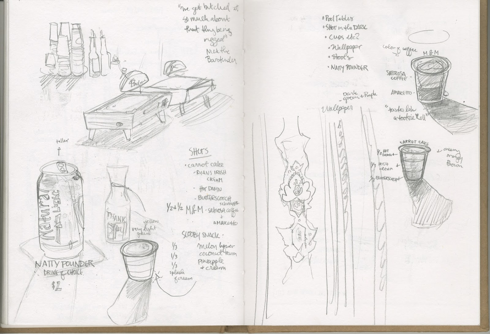
I told them my plans for the next phase of my project **SPOILER ALERT** It's Mooreman's Southside. My Favorite watering hole in Pittsburg.
 |
| Sketches from Mooreman's |
 |
| More sketches, a map on the right here. Something I will show as a final piece. |
Jamie commented on the mood of the pieces. The Daylight series was mainly soft and bright and delicate. In a bar..... delicacy is not always found. So he told me to use caution here. Since then I've been working on solutions to this. I still like white space, sense of quiet (Mooreman's is a rather quiet bar if we're being honest), and whimsy, so I wanted to keep that quality in the work. Here is an example:
 |
A pool game from February. A loss. I'll do better next time. 5x7 graphite and watercolor
|
I find that dark, heavy watercolors seem to be.. well... heavy. Watercolor should be bright and light! So I'm not going to paint a dark dingy bar scene. Not my jam. However I don't want absolute delicacy. I've decided to counteract the sweet softness of the Donuts by using brighter more vibrant colors and being a little looser with my linework. Keepin it fun! BARS R FUN
 |
| Here is another work in the series. 5x7" graphite and watercolor |
We shall see how Critique II goes! I'll report results later, see you fools around. Hey go to Mooreman's!


No comments:
Post a Comment