Wednesday, March 23, 2016

Writing 3 (blog posts for Crit II) ARTISTS POST

Since I didn't get to post one last time you get a double whammy!

First up to bat is my friend Will Cowley. Here is a link to his About Me page on his blog: https://willcowley.wordpress.com/2016/01/29/information-about-myself/

Will hopes to someday be involved in character design and storyboarding, he seems to be well on his way! His work focusses on MEANING. Symbolism, hidden agendas, etc. Here are some examples of this:


 Title: Magician's Ace of Spades Medium: Graphite Pencil Artist: Will Cowley IIITitle: Four of Diamonds Medium: Graphite Pencil Artist: Will Cowley III
Magicians Ace of Spade, Graphite.           Four of Diamonds, Graphite. 

For his first piece in critique he created an interpretation of the Brothers Grimm tale "Godfather Death" It was executed well and I could tell how much care and genuine thought went into the piece. Here, check it out! 

20160217_164911
Death's Equality, Graphite.

Please check out his blog, his post are well spoken and a joy.

UP NEXT, drumroll please..... Christen Wheat!

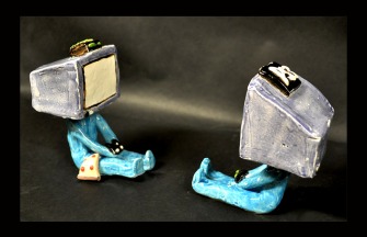
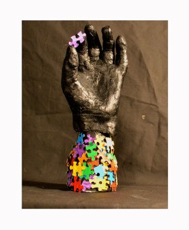
Her work also relies heavily on symbolism and the "deeper meaning." Although hers is in the 3D form. Here is a link to her blog: https://chris10wheat.wordpress.com/2016/01/29/the-person-named-christen/  She is a quiet friend of mine that seems to think deeply. She cares about all details of her work and wishes to convey meaning in all that she does. Here are some examples of her previous work:

Sloth2
My personal favorite, "Sloth"
DSC_0084
"One Puzzle at a Time"
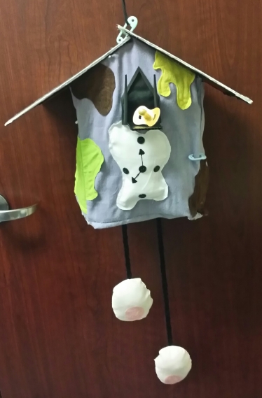
Her work also deals with time and death. She is working on a series involving these two things and the passing of human life. Each clock she will make will represent a different time in man's life. Here is her first installment in that series, which will be critiqued Friday: 

20160322_192833-1
"Goo-Goo Clock"
I'm excited to see her grow.

Writing 3 (blog posts) for Crit 2

In the last Critique I presented my Daylight Donuts series that I had been working on, 6 in total. Four 5x7"s and 2 9x12"s if you must know! Here are a few more that I haven't posted yet....

This one was fun to do. The donuts are to size. 9x12" graphite and watercolor

Coffee and an "Old Fashioned" 5x7 graphite and watercolor
This one was and still is lacking in color... I would like something soft and subtle. I'll get there PROMISE. 5x7" graphite

 I spoke with Jamie Oliver and Cynthia Allen about my work. Positive responses! YAYAYAY Jamie mentioned that he can see some of these being very marketable, he imagines them on greeting cards or postcards. I had seen them in a book format myself so the fact that he also envisioned them in print was encouraging. His only caution in that regard was the loss of the texture and tactile quality that comes with the coarseness watercolor paper. I too had these concerns but I believe that with the proper care and MILD photoshop finagaling, the delicateness will remain intact. Cynthia commented that they were fresh and delicate.

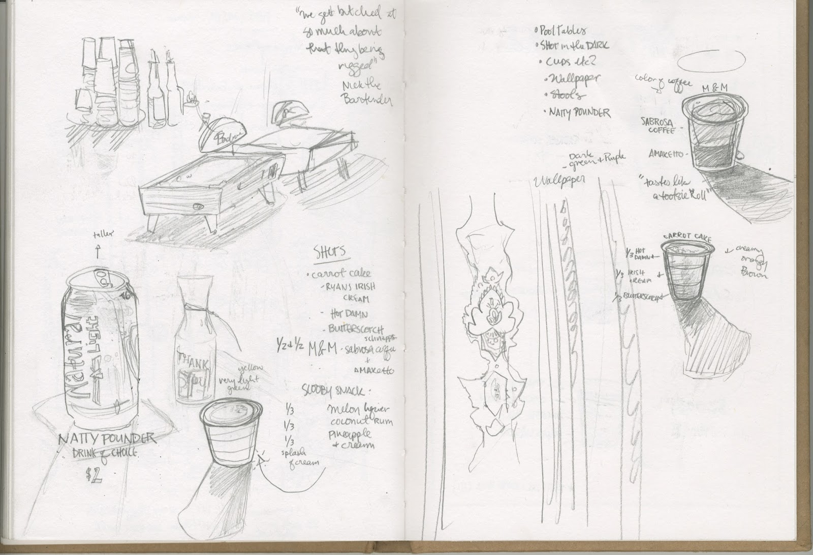
I told them my plans for the next phase of my project **SPOILER ALERT** It's Mooreman's Southside. My Favorite watering hole in Pittsburg.

Sketches from Mooreman's

More sketches, a map on the right here. Something I will show as a final piece.

Jamie commented on the mood of the pieces. The Daylight series was mainly soft and bright and delicate. In a bar..... delicacy is not always found. So he told me to use caution here. Since then I've been working on solutions to this. I still like white space, sense of quiet (Mooreman's is a rather quiet bar if we're being honest), and whimsy, so I wanted to keep that quality in the work. Here is an example:
A pool game from February. A loss. I'll do better next time. 5x7 graphite and watercolor

I find that dark, heavy watercolors seem to be.. well... heavy. Watercolor should be bright and light! So I'm not going to paint a dark dingy bar scene. Not my jam. However I don't want absolute delicacy. I've decided to counteract the sweet softness of the Donuts by using brighter more vibrant colors and being a little looser with my linework. Keepin it fun! BARS R FUN 
Here is another work in the series. 5x7" graphite and watercolor
We shall see how Critique II goes! I'll report results later, see you fools around. Hey go to Mooreman's!

Tuesday, February 16, 2016

Writing 2 Blog Post for Crit 1

When I first conceptualized this series, it was very clear what I wanted to do and what my purpose and goals were. Since then, not much has changed in my design. After meeting with Rhona McBain, my professor for this Crit Course, I became aware of the importance of SUBJECT vs. CONTENT. The subject, of course being Pittsburg. All encompassing. Content being MYSELF. It is key to keep in mind the purpose of this series, and that is to tell MY story of Pittsburg. What I see. What I like to do. What is important to me and why. However, among all this ME ME ME, there should be little peeks into others stories of Pittsburg. Small glimpses into "Oh THIS is Pittsburg." I 'm not entirely positive how I am going to do this but I have a few ideas and it is something that I'm excited to explore.
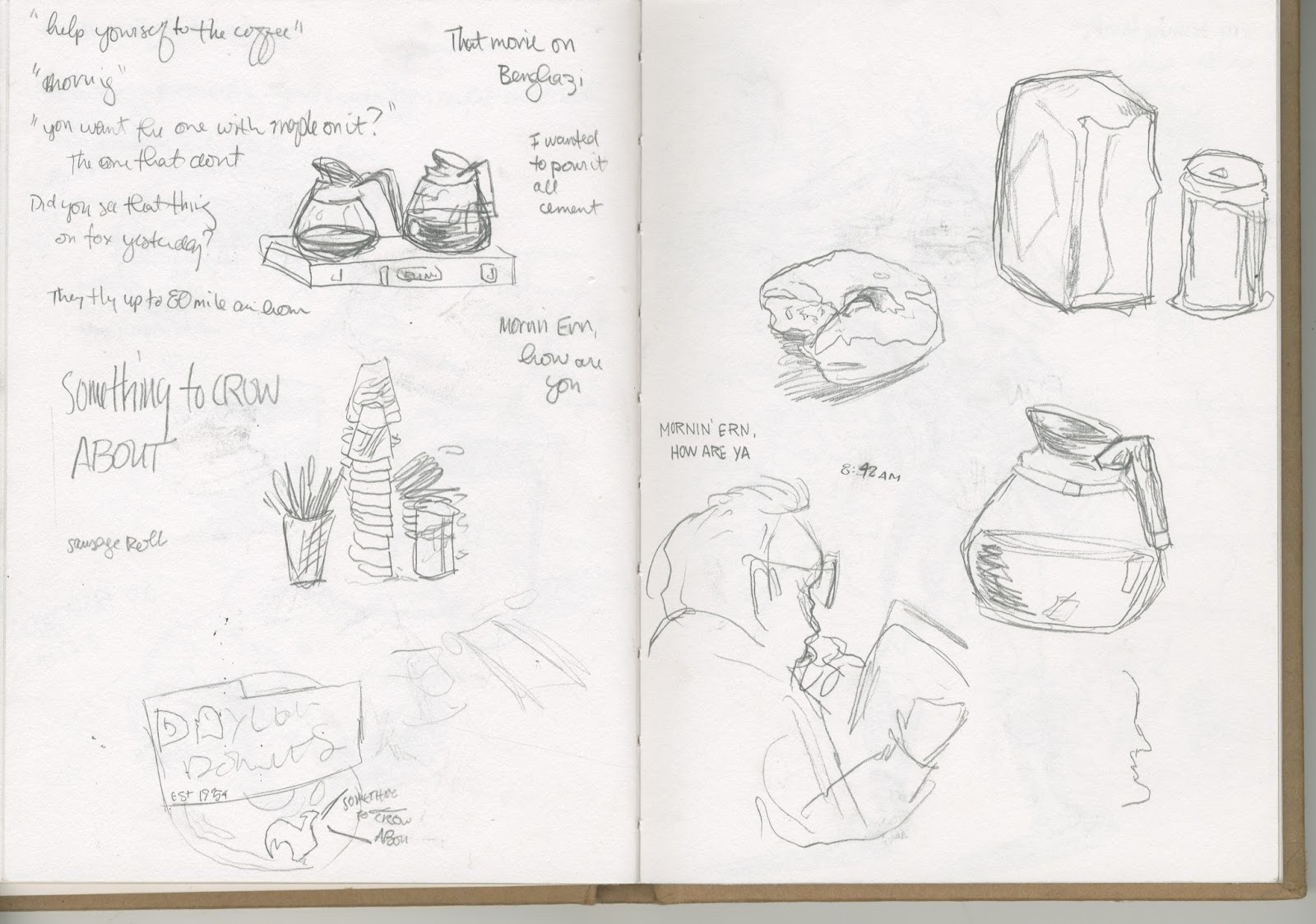
My first study (what I will be bringing to this particular crit) and one of my favorite places to go in da burg is Daylight Donuts. It is right outside my backdoor, and is important to me and my story here. I have been going in the early mornings and sketching, jotting down thoughts and things I hear and see. Here are just a few examples:


Images from my sketchbook

From these sketches and a few reference photos, I have been making watercolor and graphite studies of them. Most are 5x7" but some are larger due to content. Here's a sneak peek!
The Cake Donut: 72 cents. 


Since beginning this, I have discovered that I could honestly do an entire series on JUST Daylight Donuts. It's really been a blast. Also since starting, I can't help but see them in a book. A whole book dedicated to this. The Exhibit is not until September, so I have decided that I am just going to make as many as I feel are necessary to tell this story. I mean how could making more art than you need ever be bad?? 

In this particular phase of my project, American painter and member of the Bay Area Figurative Movement, Wayne Thiebaud is a huge inspiration. His quiet works consisting of the mundane made fabulous are beautiful and charming. 

Wayne Thiebaud, Four Cupcakes, 1971.

Wayne Thiebaud, Delicatessan Counter, 1962.

Wednesday, January 27, 2016

Writing (blog posts)_1

I was asked by a former student (Jared Jennings, fyi) to take part in a 3 person exhibit that will be located at Crowder College in Neosho, MO. For this exhibit I will be needing 10 to 15 pieces. THAT is what I will be working on this semester and for this critique course! The theme/title of the exhibition is "Untold Stories." My concept for this show and my pieces will be centered around local spots in Pittsburg, KS. This last summer was my first summer spent here in the burg, working at a pool shop (I was a pool boy, for clarification) and I fell absolutely and unconditionally in love with this town. I hear people complain almost daily about being trapped here,  in this podunk little town with nothing to do etc. But I have no qualms. I am qualmless. This town is quiet, simple, and incredibly, considered by some ALMOST TO A FAULT, m-i-d-w-e-s-t-e-r-n. I straight up love this place. So I find it enormously fitting that my series shows these quiet perfect little places that often get ignored, or are seen as commonplace or insignificant.

I would like to draw a love letter to Pittsburg.

When it comes to myself as an artist, I tend to like quiet works with lots of white space. I appreciate small drawings and pencil sketches. My work will be "sketchy," and incorporate text. I find hand rendered, almost sloppy, text to be incredibly charming. I like work that proves someone made it with their hands, I love a certain messiness in works of art. For these pieces I intend to work with graphite and watercolor. Maybe branch out?? WE'LL SEE!

Here are a few of my works that I am fond of and define my artistic sense described above.


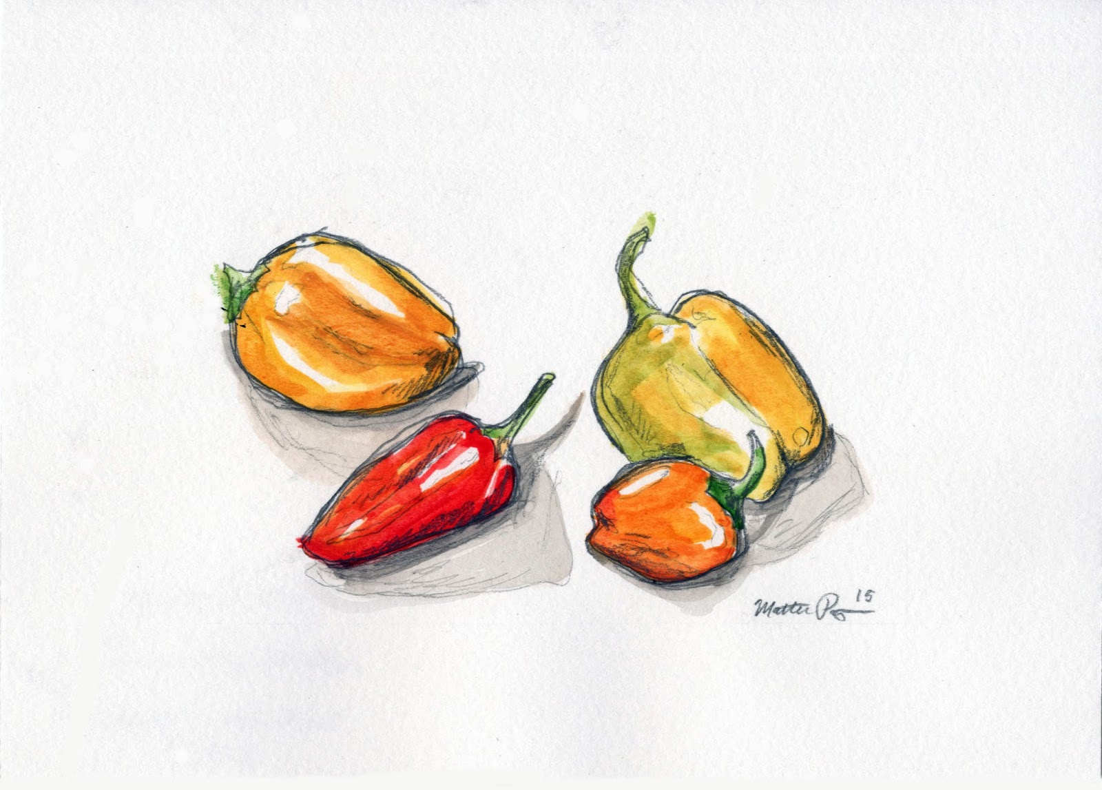
"Four Peppers" 
A couple of pencil pieces from the last Critique Course, in which I interviewed residents of a local nursing home.

Another piece from the last course. I hope to continue in this style.

One last piece, this is my mother. She is beautiful.


Not only do I want to highlight Pittsburg, I would like it to be personal. I want to show my favorite places and help illustrate WHY this place is one of my favorites on earth.
To do so, I intend to visit local restaurants, Harry's, Daylight Doughnuts etc. and illustrating something there from life. Harry's famous cinnamon rolls, possibly an interview with the owner. I will be interviewing and making portraits of my favorite professors who have shaped me here. Mooreman's is my favorite local tavern and where I learned to play pool, I would like to do a contour drawing on the interior of the bar. Lakeside Park is my favorite place to bike or run to and I would like to draw a specific tree there that is PERFECT for climbing. I have many ideas for this. I'm excited to get started on this project and see where it can go.

Like I said earlier, I enjoy quiet, sketchy works and my greatest inspirations and artist of ALL TIME AND SPACE is the effervescent Wendy Macnaughton. I cannot get enough of this chick, I tell you what. http://wendymacnaughton.com/ <---- go here. Do it. You know you want to.
Wendy Macnaughton's work. See what I'm talking about??

Her storytelling ability and poignant illustrations are simply stunna. Her work is recognizably "Wendy" and her honesty has played a huge role in my development as an artist. 

A few of her works. Wow.

OKAY ONE MORE I can't resist!
Her portraits are especially inspirational and a favorite of mine.


Another inspiration and a favorite of mine is comic and illustrator, ELEANOR DAVIS (her collection of comics, "How To Be Happy" is one of my favorite books- check it out or live a life of regret) ---> http://doing-fine.com/ her website.
I envy and someday hope to emulate her bright and creative use of watercolor in her comics and illustrations. I love in her work the astounding honesty and vulnerability that she portrays with her quiet, simple illustrations and text.
These examples are from her book, "How To Be Happy"

I have many ideas for this Critique Course. I'm excited to get started on this project and see where it can go. LET'S GO

Thursday, December 3, 2015

Coloring Book Closing Thoughts

As the semester comes to a close, so does the first HUGE component of my internship. The Erie Dinosaur Park Coloring and Activity Book. This project has absorbed a big part of my semester and life in general so it is very near and dear to my heart! As I type, a PRINTED COPY of the book is laying right next to my keyboard. That's right, a hard copy! In my hands! That I can hold and color in! Rather exciting business if you ask me. Here is a run through of the process this book went through to become an actual feasible, holdable book.

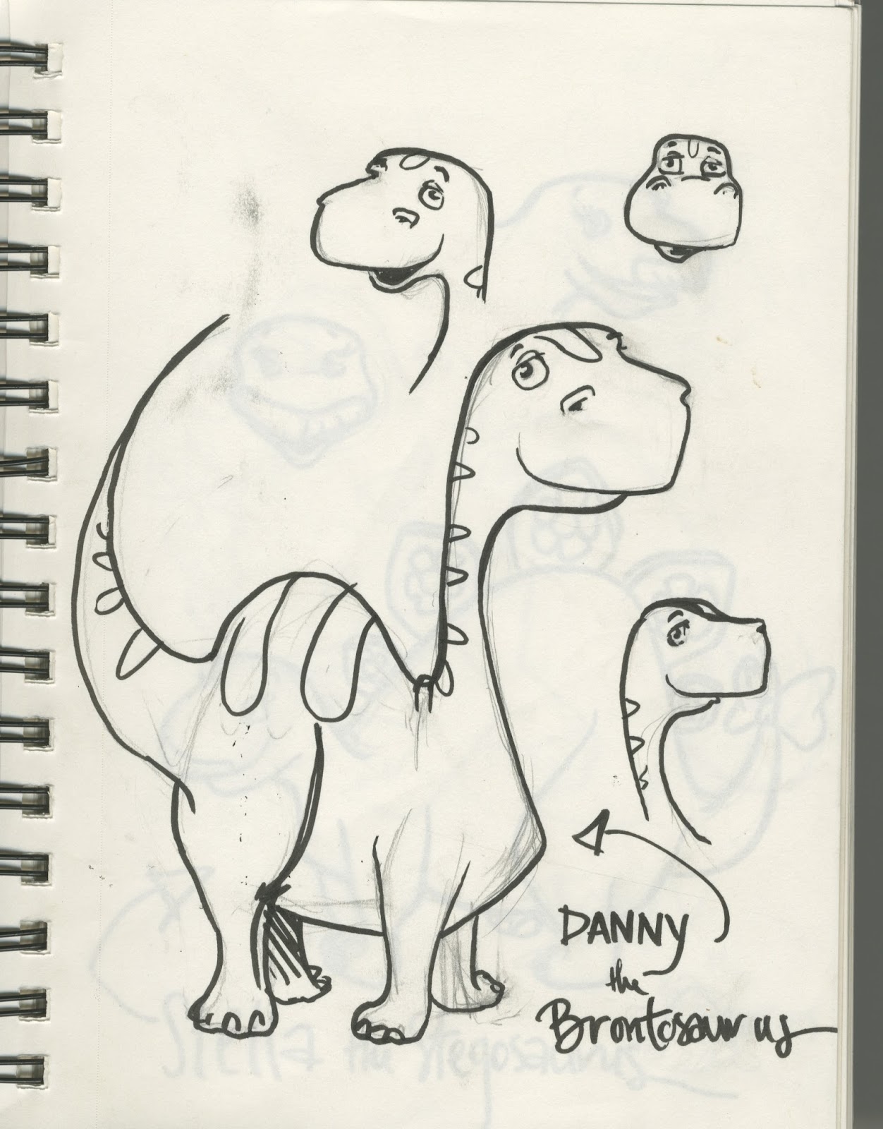
We began with the initial concept phase. My first step was to develop characters to tell a story with...
The first character sketch of Diesel (Originally named Danny)

Once I had figured out my little dinos, I then had the task of developing a story for them! What would they do? Where would they go?? I decided to have them go on an adventure (who doesn't love an adventure!) and I also wanted them to explore as many different atmospheres as possible- island, desert, snowy mountains, forest.... I felt that this would give kids variety to keep them interested. And it's fun to color! All with the end goal of reaching their new home in Erie.
After the journey, they find Kansas!
Along with the story and coloring pages, I also chose to include activity pages! I chose some of my favorites from when I was growing up.
Hand lettered word search
A fun maze
There are four activities total.
Next was selecting an image for the cover, I went over that process in my last post.

After that was the back page, recognizing the donors who helped with the cost of printing. Along with the Dorris family for their donations, and some general information about the park.
Back cover.
2,000books will be printed at 5.5 x 8.5. They are at the printers right now!

This whole internship experience has really showed me that being an artist takes much much more than possessing the ability to be creative and put a pen on the page. It requires interpersonal skills, a commitment to fine details, a certain amount of managerial skills and EMAILS. So many emails. I truly feel that this entire internship experience has shaped me and really given me a taste of my future.. and I like it!

I will be back here in the spring with info about the brochure and rack card component of the internship.

Wednesday, November 18, 2015

Coloring Book Cover

I am sorry for not posting more frequently! My mind has really been stretched thin this semester and some things tend to fall through the cracks (this being one of them!)

In regards to the Cover for the coloring book, I was considering traditional color- a vibrant watercolor. However, in the end I decided to go digital. It is the future after all.

I began with the first page of the coloring book. I decided to go with this image for the cover because I was very pleased with the composition and the line quality achieved. I feel that the dino's were all front and center and this image allowed for some fun color options!

Image from the first page.


 Next, I handlettered the title and my information at the bottom of the page. I felt that this font for the title was fun and complimented the overall aesthetic of the book.
With Text!
 Next comes COLOR. Something rather daunting for me. I tend to work in Black and white, and shades of grey.... However this project required fun, bright, and vibrant colors. 


The final cover design.
Yesterday I took a pdf file of the coloring book to the printing services on campus to print three proofs for us to see how the pages look on the paper and at the size we have chosen to print at (8.5 x 5.5) I CANNOT WAIT to see the finished product.

As of right now, I am in the middle of compiling images and information for the pamphlet to promote the park. I am having a little bit of an issue with the Indesign program that I am using to make the pamphlet. My computer skills are rudimentary at best. However I have been seeking out the help of my Graphic Design savvy friends and they are helping me immensely! Having talented friends is a blessing!  

Tuesday, November 3, 2015

Portfolio


I intend to enter an art fair here at Pittsburg State, where I will be selling my art. For the fair I wanted to post some examples of my art! ENJOY
The final page of a coloring book that I've been working on all semester for the city of Erie, KS. At the end of the semester they intend to print 2,000 copies.


Watercolor and graphite

Watercolor and Ink
Watercolor and Graphite

Graphite selfie
Watercolor and Graphite
Colored Pencil. I've been working on a flower illustrations that I would like to sell prints or originals of at the fair.


Graphite Illustrations from a narrative that I created from a conversation that I had with Mr. Tom Turner at Golden Living Center in Pittsburg.


MORE colored pencil works. A medium that I've really enjoyed exploring lately.

Graphite. This is from a conversation that I had with Mr. Gene Shaffer also at Golden Living Center in Pittsburg.

Colored Pencil
Ink and Watercolor
Ink.


Watercolor portrait for the Student Body President

Watercolor, a gentleman that I met at Golden Living Center last semester.

Along with things like this, I am working on a small auto-bio comic that explores my internal battle between wanting to lead a small, country lifestyle and a city life, living out my dreams as an artist. Titled "Milk and Martini's." This will be entered in the art fair.